Why Showing Everything Sells Nothing — The Overstyling Trap
Why Showing Everything Sells Nothing — The Overstyling Trap
There’s a mistake almost every brand makes the first time they invest in lifestyle photography.
They try to get their money’s worth.
One shoot. One day. One chance. So they bring everything — every piece, every pattern, every prop they own.
The result is an image that cost more than it should have and sells less than it could.
Why Overstyling Happens
A professional photo shoot is expensive.
$3,000 to $8,000 for a single day creates pressure to maximize every frame. If you’re paying that much, the instinct is to fill the scene — more pieces, more props, more setups, more value from the investment.
It feels responsible. It feels thorough.
It isn’t.
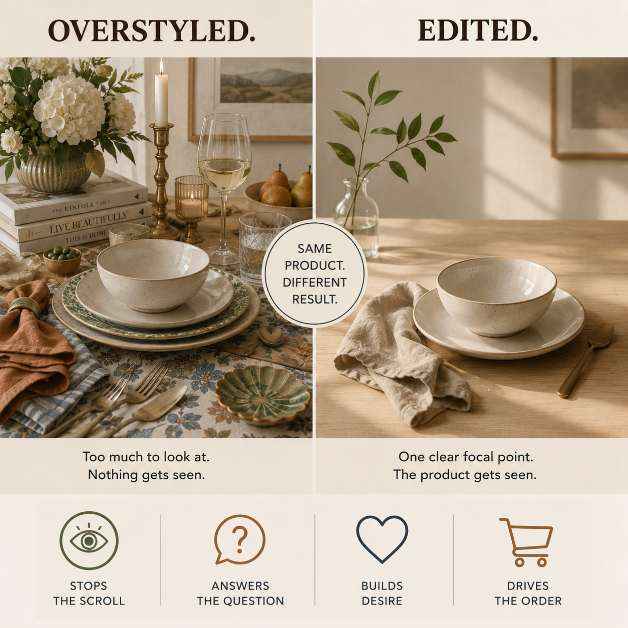
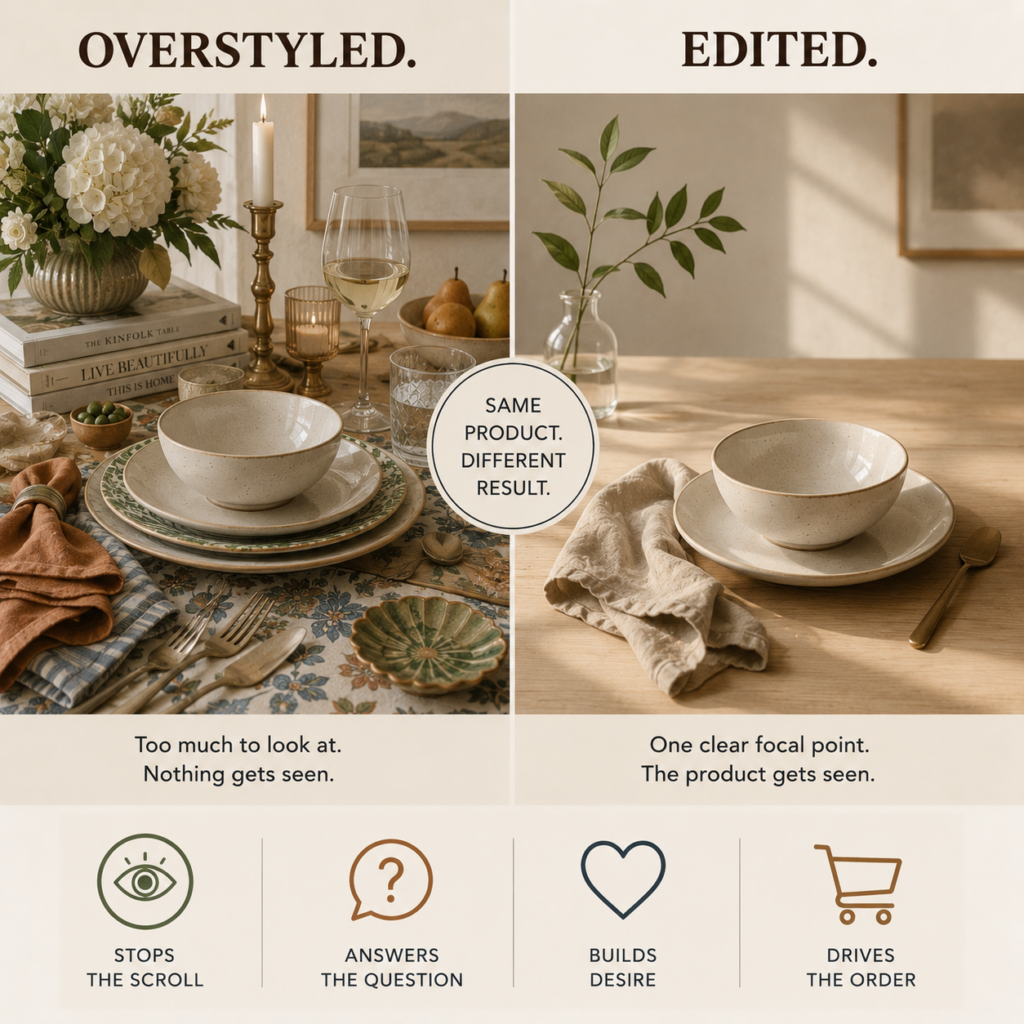
Every element you add to a scene competes with the product you’re trying to sell.
More props mean more places for the buyer’s eye to wander. More pieces mean no single piece gets the attention it deserves. More visual information means longer processing time — and online, processing time is the enemy of the sale.
The shoot cost logic backfires completely.
What Sensory Overload Does to a Buyer
Online buyers make decisions in seconds.
On Pinterest, Instagram, and Faire, you have roughly two seconds to stop a scroll. In those two seconds, the buyer’s eye needs to land somewhere, understand something, and feel something.
A cluttered image gives the eye nowhere to land.
When there’s too much to look at, the brain does the only thing it can — it moves on.
The buyer doesn’t think: “there’s too much going on here.”
They just keep scrolling.
That’s not a conversion problem. That’s a composition problem.
Bed Bath & Beyond built an entire brand identity around busy, promotional imagery — every surface covered, every product competing for attention. Their stores felt the same way. The result was a brand that couldn’t communicate quality even when the product warranted it. Buyers felt overwhelmed, not inspired.
The imagery told the wrong story for twenty years.
The Sterile Environment Problem
Some brands overcorrect.
Faced with the overstyling problem, they strip everything out. White background. Product only. Nothing else.
Clean. Safe. Forgettable.
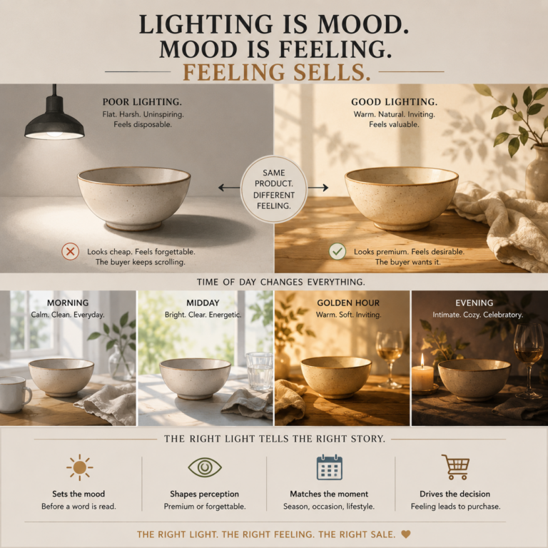
A sterile environment removes the context that creates desire.
Buyers don’t just want to see what something looks like. They want to feel where it belongs.
A bowl on a white background is a product. A bowl on a worn wooden table with morning light and a linen napkin is an object of desire.
The white background answers what. The scene answers why.
Buyers need both — but they need the why first.
What Stops the Scroll
The images that stop buyers mid-scroll share one quality.
There is one clear thing to look at.
Not one product — one focal point. One place for the eye to land, understand, and settle.
Everything else in the frame serves that focal point without competing with it.
Supporting elements — a linen napkin, a stem of greenery, a second piece placed deliberately in the background — create context and depth. They tell the story of where the product lives.
But they stay in their lane.
Negative space is not empty space. It’s breathing room for the product to be seen.
The most effective product compositions:
- Have one clear hero element
- Use supporting props to suggest context, not fill space
- Leave room for the eye to rest
- Answer “where does this live?” without overwhelming “what is this?”
What the Best Brands Do
Perigold built their entire platform on editorial restraint.
Every image has a point of view. One dominant element. Supporting pieces that add depth without noise. The buyer’s eye always knows where to go.
The result is imagery that feels luxury — not because the props are expensive, but because the composition communicates confidence. We know what we’re showing you. We know why it matters.
RH does the same thing at scale. A single chair in a vast, quiet room. One table set with deliberate negative space. The emptiness is part of the message.
Food52 edits their food and tableware imagery to a single moment — one bowl, one hand, one gesture. The restraint makes it feel real and immediate.
None of these brands are showing you everything they have.
They’re showing you exactly what you need to see to want it.
That’s not an accident. It’s a strategy.
The One Question That Fixes Composition
Before adding anything to a scene, ask one question:
Does this element help the buyer understand the product — or does it distract from it?
If the answer is distract, it doesn’t belong in the frame.
That discipline — removing everything that doesn’t serve the sale — is what separates imagery that moves product from imagery that documents it.
Your product deserves a frame that lets it be seen.
One clear focal point. One honest setting. One moment that answers the buyer’s question before they ask it.
That’s the image that sells.
Go483 builds lifestyle image systems for wholesale home and tableware brands — composed with intention, built to sell. Learn how it works.